How to Style a Dark Gray Accent Wall in a Narrow Hallway
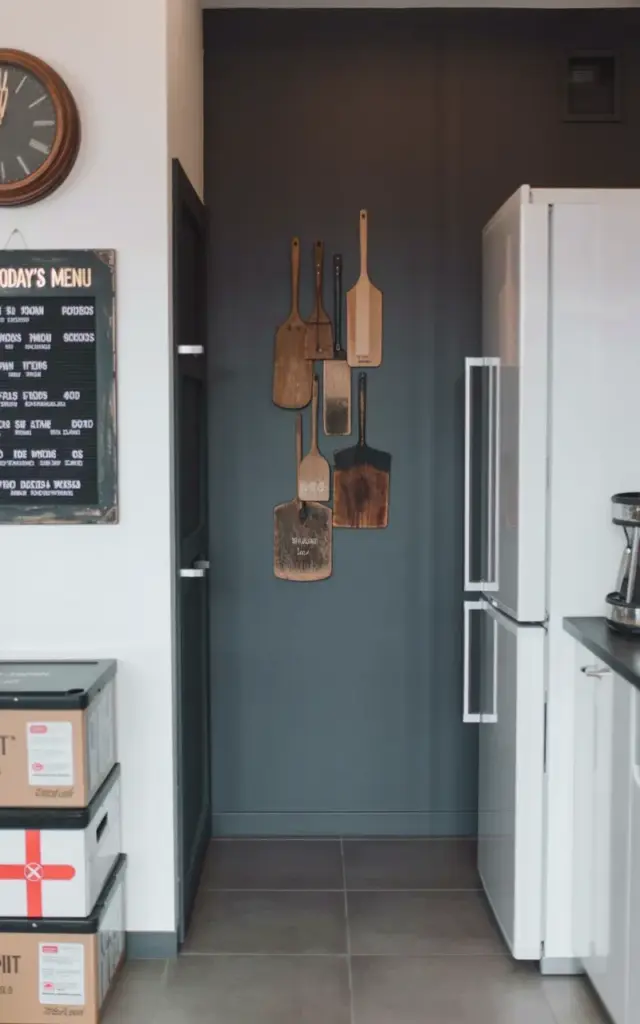
Look, I’ll be honest. When I first saw that dark gray accent wall wedged between white walls and a big white fridge, I thought it would feel cramped. But it doesn’t. The trick here is that the dark gray acts like a visual anchor, not a wall of doom. It pulls the eye forward, especially when you keep the ceiling and adjacent walls bright white. In the photo you see a deep charcoal tone that almost reads as slate. That color works because it’s not black, it has a soft, dusty undertone that plays nicely with the warm wood of the clock and the gold lettering on the menu board.
Here’s the thing: a narrow hallway needs a strong focal point, otherwise it’s just a corridor you rush through. The dark gray accent wall gives you that. Pair it with a lighter floor (those large gray tiles in the photo reflect light) and you’ve got a grounded but open feel. One weird little detail I noticed? The wall isn’t painted all the way to the ceiling on the left side, it stops where the white wall starts. That asymmetry actually helps the space breathe.
Pro tip: if your hallway gets no natural light, go for a matte finish on the dark gray. Glossy will only highlight every dust bunny and uneven patch. I learned that the hard way in my own hall last year.
Vintage Menu Board Decor That Actually Works in a Modern Home
That black menu board with gold text reading “TODAY’S MENU” is pure genius. It’s not just a cute piece of nostalgia, it solves the problem of a blank white wall without adding clutter. And here’s the kicker: you can use it as a functional family command center. Write the week’s meals on it, or a silly joke, or today’s to-do list. The gold lettering catches light from the hallway fixture and gives a little wink of luxury to an otherwise utilitarian area.
But let’s talk about placement. In the photo, the menu board is mounted on the white wall, not the dark gray one. Smart move. The contrast pops more against white, and it lets the dark gray wall stay clean for other elements (like that wooden clock). I’ve seen people cram everything onto one accent wall and it looks like a thrift store exploded. Instead, let the accent wall be the backdrop for one or two substantial pieces, and use side walls for the smaller stuff.
- Hang your vintage board at eye level, not too high, you want it readable without craning your neck.
- Use removable adhesive strips if you rent. The gold lettering is delicate and you don’t want to damage the frame.
- Pair it with a small shelf underneath for a piece of chalk or a tiny plant. Just don’t overcrowd.
First Aid Kit and Refrigerator in a Hallway? Yes, It Works
Ok so let me address the elephant in the room: why is there a fridge in a hallway? Honestly, I love it. That white refrigerator with silver handles looks like it belongs in a tiny house or a mudroom setup. It’s practical for a second fridge for extra drinks, or maybe you live in a studio and this IS your main fridge. The stacked boxes with the red cross symbol sit right below the menu board, and they’re labeled clearly, that’s a first aid kit. But here’s the thing: it’s not hidden. It’s out in the open.
Some people would cry about visual clutter. But for a family with kids or pets, having a first aid kit front and center is smart. And because it’s in nice boxes (not a messy plastic bin), it reads as intentional decor. I once had a friend who stored her emergency supplies in a vintage cookie tin. Same vibe. Functionality doesn’t have to be ugly. The white fridge balances the dark wall on the opposite side, creating a yin-yang thing. It’s weird but it works.
Another detail: the first aid boxes are stacked, not scattered. Keep that uniformity. If you’re going to put functional items on display, group them. A single first aid bottle would look sad. Three boxes with that red cross? That’s a statement.
Choosing the Right Flooring for a Dark Gray Hallway
That large-format gray tile in the photo is doing a lot of heavy lifting. It’s light enough to keep the space from feeling like a cave, but it has enough gray in it to tie into the accent wall. The tiles are laid in a straightforward grid, no diagonal pattern or fancy herringbone. That’s a good call, a hallway is busy enough without your floor competing for attention. I’m not gonna lie, I’m a sucker for a wide plank tile in a hall. It makes the space feel longer and cleaner.
If you’re on a budget, consider a luxury vinyl plank in a similar gray tone. It’s softer underfoot (especially if you stand barefoot organizing that menu board) and easier to install. But if you have the budget for real tile, the large format reduces grout lines, which means less visual noise. Just watch out for slippery finishes, hallway traffic means kids running, pets sliding, you carrying laundry baskets. A matte or slightly textured tile is safer and hides crumbs better.
One more thing: that floor tile reflects light upward. Paired with the dark gray wall, it creates a nice contrast that defines the hallway as its own zone, separate from the rooms on either side.
Mixing Modern Storage with Old School Charm
This is where the magic happens. You’ve got a modern white fridge, sleek silver handles, neat boxes, and then a vintage black menu board and a dark wooden clock with a round face. The clock is mounted high on the left wall, almost near the ceiling. Why? Because it functions as a secondary focal point that draws the eye up, making the ceiling feel taller. The dark wood of the clock echoes the dark gray wall and ties the whole look together.
The secret here is restraint. You don’t need a whole wall of vintage signs. Two pieces, the menu board and the clock, are enough. The rest is modern and minimal. I’ve seen people try to do full-on farmhouse in a hall and it ends up looking like a Pumpkin Spice explosion. This is more curated. The modern fridge keeps the feet on the ground, while the vintage pieces add personality. If you’re recreating this, pick one modern element (fridge, sleek shelf, metal hooks) and one vintage anchor (menu board, old clock, a worn-in mirror). That’s your ratio.
Honestly, the wooden clock is my favorite part. It’s not trying to be trendy. It’s just there, ticking along, being functional and warm. I have a similar one in my kitchen and it drives my partner crazy because it’s loud. But for a hallway? The tick is a cozy background noise.
Practical Tips for Recreating This Look Without Breaking the Bank
You don’t need to buy a vintage menu board from a pricey antique shop. Hit up a thrift store or even a garage sale. Look for a blackboard with a wooden frame, you can paint the frame dark if needed. The gold lettering? Use a gold paint marker. Write your own “TODAY’S MENU” or something personal like “THIS WEEK’S MADNESS”. The clock can be from IKEA or a flea market. The dark gray paint? A quart is plenty for a small accent wall. Go with something like Benjamin Moore’s “Chelsea Gray” or a similar deep warm gray.
For the storage: the first aid boxes can be plain cardboard boxes spray-painted red with a white cross stencil. Or buy actual first aid kits that come in nice boxes (many brands do). The fridge is the biggest splurge, but you can find compact refrigerators for under $200. Or skip the fridge entirely and use a tall cabinet or a slim bookshelf. The point is to balance a heavy dark wall with a light, blocky piece on the opposite side.
One last rant: don’t forget the lighting. A warm overhead light or a simple sconce will make the dark gray wall feel inviting, not oppressive. In the photo, the lighting is soft and even, no harsh shadows. That’s key. If your hallway has overhead can lights, swap the bulbs for warm white (2700K). Trust me, it makes a huge difference.
So yeah, this hallway setup is proof that a dark gray accent wall doesn’t have to be a design dare. Pair it with vintage finds that tell a story and modern storage that actually works. The menu board, the clock, the first aid kit, the fridge, they all play their part. It’s a small space but it’s packed with intention. And that’s what makes a house feel like a home.
If you try this look, tag me? I’d love to see how it turns out. And if you’ve got a weird hallway corner that needs a refresh, start with that can of dark gray paint. Sometimes one wall is all it takes.
#hallwaydecor #accentwallideas #modernhallway #vintagehomedecor #mudroomstyle