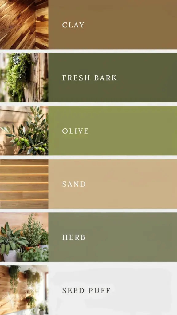
I stumbled on this gorgeous Natural Earth Tone Colour Palette and honestly, it stopped me mid-scroll. Full of warm browns, olive greens, and sandy beiges, it’s the kind of grounding palette that makes you want to breathe deeper. If you’re into organic colour schemes for anything from wellness branding to interior mood boards, you’ll want to save this one. That deep caramel brown? It looks like melted brown sugar. The olive reminds me of the dusty leaves on my neighbour’s unpruned rosemary bush. And the beige is exactly the colour of the sand at my local beach after a storm. Not kidding.
What Exactly Are Earth Tone Colours (for complete beginners)
Look, I didn’t know what “earth tones” really meant until a few years ago. I thought it was just brown, maybe some green. Then I tried to paint my bathroom terracotta and it looked like a pumpkin exploded in there. So let me save you my mistake.
Earth tone colours are the shades you’d scrape off a real patch of ground. Not the perfect stuff in a potted plant, but actual dirt, clay, moss, bark, stone. They sit on the warm side of the colour wheel. Browns with a touch of red or yellow. Greens that lean toward yellow rather than blue. Beiges that look like they have a little sand mixed in. No neon, no pure white. I’ve seen them called “muted naturals” and I guess that works, but I prefer to think of them as colours that don’t need to yell to be seen.
The palette I’m sharing has three stars: a warm chocolate brown, a dusty olive green, and a soft sandy beige. That’s your core trio. You can stretch it by adding a copper accent or a charcoal if you want, but those three alone do the job. Honestly, I tried replacing the sand beige with a cream once and the whole thing fell flat. Too much like white. So stick with these.
Why Wellness Brands Keep Using This Palette
I’ve noticed a lot of yoga studios and organic tea companies lean hard into earth tones. There’s a reason for that. It’s not just a trend. When you see that olive green next to that warm brown, your brain does something quiet. It feels steadier. Less jittery. Like you just sat down on a soft rug after a long day.
For wellness branding, this branding palette works because it signals safety, warmth, and realness. Not the fake kind of realness, but the actual dirt-on-your-fingers kind. A brand using a black-and-white grid looks modern, sure. A brand using deep purple looks luxurious. But a wellness design built on these natural hues says: we’re not trying to impress you. We’re trying to hold space for you. That’s powerful.
Here’s something I learned the hard way: don’t overdesign the palette. If you’re putting together a logo or a website header, resist the urge to add a fourth or fifth colour. These three have enough range. The brown works for headers, the beige for backgrounds, the olive for buttons or icons. One more colour and you risk cluttering the calm. Your audience won’t know why, but they’ll feel the difference. Trust me on this.
How to Create a Mood Board with Natural Hues (Without Overthinking It)
Ok so mood boards can be intimidating if you’re a beginner. I get it. You open Pinterest and suddenly everyone has these perfectly layered photos of linen and dried flowers and half a lemon. But a mood board is really just a collection of things that make the same feeling. And for an earth tone palette, the feeling is “grounded” and “alive”.
Start with one image that contains all three colours. Maybe a photo of an oak tree trunk with brown bark, olive moss, and beige soil at the base. Then add a fabric swatch (a wool blanket or a piece of raw linen works), a paint chip from a hardware store, a screenshot of a brand you admire that uses similar tones. I like to throw in a picture of my own dusty boots just to keep it honest.
Here’s a simple list of things you can pull into a natural hues mood board:
- A snapshot of a forest floor after rain, where everything is damp and dark and smells like mushrooms. That’s your shadow tone.
- A piece of unbleached cotton or linen fabric. Even a napkin works if it’s off-white and a bit rough. Texture matters more than you’d think.
- A dried eucalyptus branch or a bundle of wheat. Dried things are practically cheating for earth tone boards because they already have that muted, dusty quality.
- A ceramic mug in a warm brown glaze, preferably one with a tiny chip in the rim because it looks more human.
- One small splash of a lighter neutral, like a piece of creamy paper or a shell. Just to keep the board from feeling too heavy.
You don’t need to buy anything. Really. I made my first mood board from photos on my phone and a paper bag from the grocery store. The point is to gather what already feels right, not to chase a perfect aesthetic.
Pairing Warm Browns with Olive Greens (and Why It Works So Well)
I used to think brown and green were a boring combo. A kid’s school uniform, maybe a military jacket over khakis. But then I saw this specific combination up close at a friend’s house. She had a brown leather sofa and an olive green throw pillow, and the whole room felt like a hug. That’s when I understood. The trick is the warmth.
Brown and olive green are both naturally warm colours. They live next to each other on the colour wheel, but not too close. Brown is basically a dark orange that’s been humbled by black. Olive is green that borrowed a little yellow from the sun. So when you put them together, they don’t fight. They blend. It’s like seeing a tree trunk next to its own leaves. Really obvious once you notice it.
For a warm brown olive green palette I’d recommend keeping the brown as your dominant colour and using the green as an accent, unless you want the room or the brand to feel more earthy than cosy. If you flip it and use olive as the main colour, it can lean a bit mossy, almost damp. That can work for a garden brand or a herbal product, but for a wellness brand that wants to feel safe, let the brown lead.
One thing that surprised me: a soft copper metallic adds an incredible pop without breaking the natural vibe. Not gold. Gold is too flashy. But a brushed copper lamp or a copper foil logo detail catches the light in a way that feels like sunset through a window. Try it.
Using Earth Tones in Your Home Decor Without Making It Look Like a Cave
Not gonna lie, I made a cave the first time. I painted three walls dark brown and one wall olive green, and suddenly my living room was a tomb. Nobody wanted to sit in there. My cat refused to enter. That’s the risk of earth tones: too much and you lose the light.
The fix is balance. Use the earth tone colour scheme on the things you touch, not just the things you look at. So put the brown on a rug or a throw blanket instead of the entire wall. Paint the wall the sandy beige, which bounces some light, and then bring in the brown and olive through furniture, cushions, or art. That way the room breathes. It’s grounded, not suffocating.
Another trick I figured out after too many Pinterest fails: white trim. I know, white isn’t earth tone, but a clean white window frame or baseboard acts like a little gap of air around the heavy colours. It stops the room from feeling like a closed box. If you hate white, use a very light cream or a pale limestone grey. Same effect, less jarring.
If you’re decorating a rental or a space you can’t paint, just swap in earth tone textiles. A brown linen duvet, an olive cushion, a beige throw. That’s enough to shift the energy of a room without committing to a paint colour you might hate in six months. I once used an olive t-shirt as a temporary curtain. It looked surprisingly good. Desperate times, but honest.
Where to Find More Colour Inspiration Like This (That Isn’t Just Pinterest)
Pinterest is great, but it can be a spiral. You search “earth tone palette” and an hour later you’re looking at terrazzo tiles you don’t need. So here are some real-world places I find colour inspiration that keeps me on track.
Go to a garden centre. Not the fancy one with the café, the one that smells like potting soil and fertiliser. Walk through the clay pot section. Look at the variations between a terracotta pot, a glazed brown pot, and a concrete one. That’s your colour education for free. Then walk past the herbs and notice how rosemary is a different green than sage, which is different from thyme. Write down the hex codes later if you want, but the real learning is looking.
Another weird one: a hardware store paint chip rack. Stand there for ten minutes and grab every brown, beige, and olive that catches your eye. You’ll end up with twenty chips. Then throw away half of them at home. The ones you keep are your real palette. It’s a cheap way to personalise a generic scheme.
And my favourite: your own kitchen. A dried bay leaf, a cinnamon stick, a piece of wholemeal bread (the darker kind, not the fluffy white). Those are earth tones sitting on your counter. Take a photo of them in morning light. That is the most honest colour inspiration you’ll ever get. No filter needed.
Anyway, I hope this palette and these tips help you build something that actually feels like you. Because that’s the whole point. Not to copy a trend, but to create something that makes you want to sit still for a minute and breathe. Save this post for your next creative project, and feel free to drop a comment with your favourite earthy colour combo. I’m always looking for new ones. Even if I do end up with a cave again.
#earthtonecolours #brandingpalette #wellnessdesign #naturalhues #colourinspiration