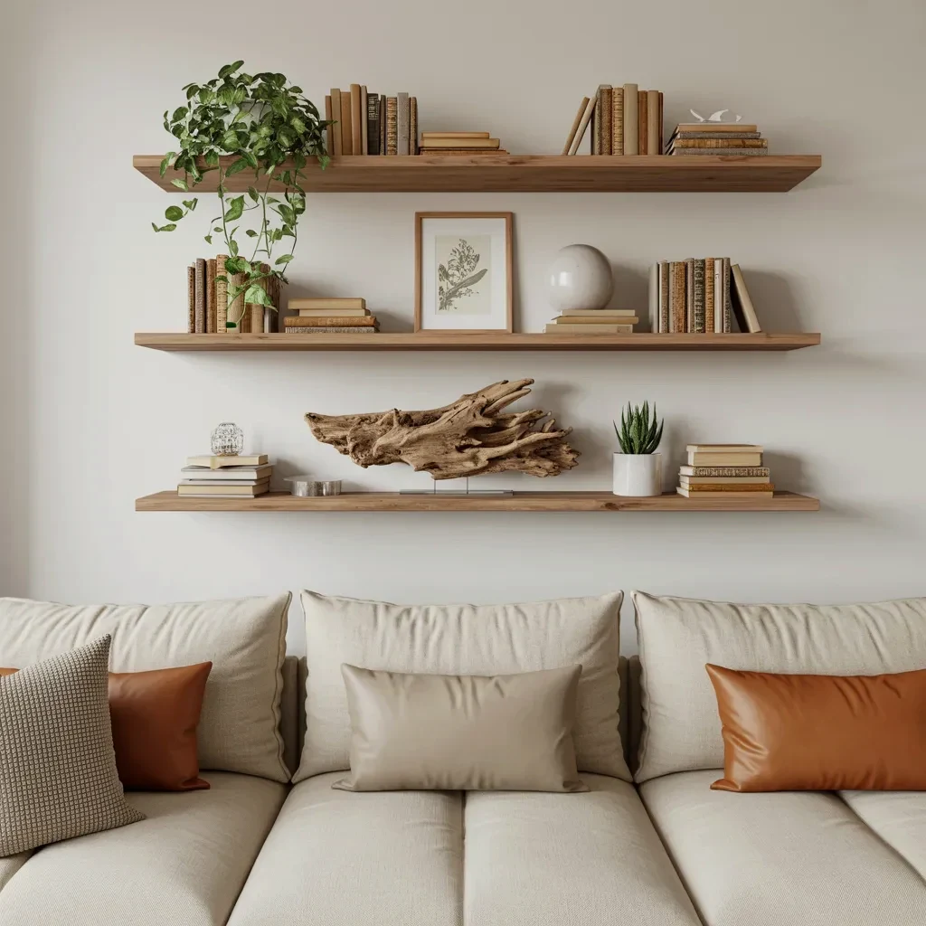
You see them everywhere on Pinterest: perfectly styled floating shelves with just the right amount of books, a trailing plant, maybe a piece of driftwood. But when you try it at home, your shelves end up looking either cluttered or awkwardly empty. I’ve been there. The #1 mistake people make with floating shelf decor in a minimalist living room is ignoring visual weight distribution. It’s not about how many items you own. It’s about where you put them.
Let me show you what I mean. A few weeks ago I styled four wood shelves above a light beige sectional. Top shelf: a trailing plant in a white pot, drawing the eye upward. Then I alternated books with a framed botanical print, a white sphere, and a chunk of driftwood. Heavy stuff stayed low. Light, airy pieces went high. The whole thing cost me under forty bucks. And it looks calm, intentional, and perfectly balanced. No fancy store-bought decor required.
Why visual weight distribution matters more than your decor budget
Here’s the thing: you can spend a lot on a single ceramic vase, but if you place it on the wrong shelf, your whole arrangement feels lopsided. Visual weight is about how heavy an object looks, not how much it weighs. A dark book stack feels heavy. A pale driftwood piece feels light. A large framed print has more pull than a small candle.
In that photo I mentioned, I kept the driftwood on the third shelf. It’s large, textured, and dark enough to anchor the middle. The trailing plant? That’s the lightest thing I own. Honestly, it’s a cutting from a friend’s pothos, propped in a thrifted pot. But it lifts the whole composition because it sits high and drapes down empty space. That’s the trick: heavy things low, light things high. Without that, your shelves look like they’re wearing mismatched shoes.
Look, I’m not a professional stylist. But I’ve made this mistake more times than I want to admit. I once shoved a heavy stone vase on a top shelf and wondered why the whole wall felt tense. Move it down to the second shelf. Instant relief.
How to edit your shelf decor before you start arranging
Ok so the most overlooked step in shelf styling tips is editing. You cannot style a pile of stuff. You need a curated stack. Start by taking everything off the shelves. Yes, everything. Then group your items by size, color, and material. Be ruthless:
- Anything chipped, faded, or dusty? Toss it. Donate it. Put it in a box marked “maybe later” and hide it for a month.
- Duplicate tchotchkes (like those three identical white candles) look cheap. Keep one, give the others away.
- Books: keep only the ones with covers you actually enjoy looking at. Flip the spines to create neutral color blocks if the titles are loud.
- Anything sentimental that has zero visual appeal (like a coffee mug from a conference) does not belong on a shelf. Put it inside a cabinet. I mean it.
When I edited my shelves for that photo, I started with about thirty objects. Ended up with nine. Not gonna lie, it hurt a little. But the result was a clean, breathable wall that made the whole room feel bigger. And I spent zero dollars on that purge. Editing is free.
The rule of odd numbers (and when to break it)
You’ve probably heard the old design rule: odd numbers look more natural, even numbers look stiff. I mostly agree. For a minimalist living room, groups of three or five objects per shelf create an effortless rhythm. In my photo, the top shelf has a single plant plus a small stack of books. That’s actually two elements (even), but the plant is tall and the books are low, so it still feels unbalanced in a good way. The rule bends when scale varies dramatically.
The third shelf has the driftwood as one big piece, then I added a small ceramic sphere and a tiny book. That’s three objects. It feels grounded. The bottom shelf has two books and a plant. Even number again, but the plant is taller than the books, so the silhouette is uneven. That asymmetry is what keeps minimalism from feeling boring.
So here’s my rule: start with odd numbers. If it looks off, try an even group but make sure the tallest item is not in the center. Off-center placement creates a natural break. Anyway, don’t overthink it. Take a photo with your phone and look at it. Your eyes will tell you if something is wrong.
Budget-friendly alternatives to expensive decor pieces
Since this is a budget-conscious guide, let’s talk real numbers. That trailing plant? I grew it from a cutting in a glass of water. Took three weeks to root. The white pot came from a thrift store for two dollars. The botanical print? I downloaded a free vintage illustration from the public domain, printed it on standard copy paper, and put it in an IKEA frame I already owned. The driftwood? Picked it up on a beach walk. My shoes got wet. Totally worth it.
The books are from a library sale. Fifty cents each. I only bought ones with neutral cloth spines in beige, brown, and navy. No dust jackets. If you can’t find cheap cloth-bound books, wrap paperbacks in brown kraft paper. It looks intentional and costs pennies.
For modern home decor on a shoestring, focus on texture: wood, paper, stone, ceramic. One smooth white sphere (mine is a cleaned-up thrift-store candle holder) breaks up all that organic roughness. Do not underestimate the power of a single small object that introduces a different surface finish. It makes the whole shelf look thoughtfully styled, even if everything is secondhand.
How to use plants to anchor your floating shelf layout
A trailing plant is the cheapest, most effective way to add vertical movement to your living room shelves. The one in my photo is a simple pothos. It cascades down about eighteen inches. That downward line pulls your eye from the top shelf to the middle, creating a visual bridge between objects. Without it, the shelves would feel like separate islands.
But not every shelf needs a plant. Put the biggest plant on the top shelf (or the one you want to draw attention to). Then let it drape past the shelf below. That overlap is what makes a shelf arrangement feel cohesive. If you can’t do a trailing plant, use a tall snake plant or a dried branch. Honestly, even a single stem in a skinny vase works.
One weird detail I noticed: people often place plants in the center of a shelf. Please don’t. Push them to one side. Let them lean a little. A plant that is slightly askew looks alive, not posed. That little imperfection is what makes a minimalist room feel human instead of sterile.
Three affordable shelf styling patterns that always work
If you’re stuck, try these patterns. They’re like training wheels for shelf styling, and they cost nothing to test:
- The triangle. Place your tallest item on one end, a medium item in the middle on the opposite side, and a small item near the tall one. This creates a visual triangle across the shelf. Example: tall plant on the left, medium stack of books on the right, small object at the base of the plant.
- The stack and lean. Lay books flat in a pile, then lean a framed print against the stack. This works on a lower shelf to anchor the weight. In my photo, I leaned the botanical print against a stack of three books. The print is slightly tilted, not perfectly vertical. That slight angle adds softness.
- The solo statement. One large object centered on the shelf with nothing else. This is scary for hoarders like me, but it works on one shelf if the other shelves are busier. I used this on the third shelf with the driftwood as the lone object. It breathes. Try it with a large vase, a sculpture, or a single stack of oversized books.
These patterns work with any budget. Your “large statement” could be a giant piece of bark. Or a collection of twigs tied with twine. Or an empty picture frame. Seriously. I once used an old wooden cutting board propped against the wall. It looked like an art piece. Total cost: zero.
One last trick for a truly minimalist look
After you arrange everything, step back. Like, three whole steps. Then remove one item from each shelf. Yes, even if you think it already looks perfect. Take one thing away. Nine times out of ten, the shelf looks better. Minimalism is subtraction.
I do this every time. And sometimes I cry a little inside because I love my little ceramic squirrel. But the shelf looks cleaner, and that matters more. You can always bring the squirrel out in six months when you refresh the shelf.
Try this approach with your own shelf styling tips this weekend. Use what you have. Move things around. Take a photo. Move them again. You don’t need to spend a dime. And if your space looks anything like my four wood shelves above that beige sectional, you’ll wonder why you ever overthought it in the first place.
#floating shelf decor #minimalist living room #shelf styling tips #living room shelves #modern home decor